You’ve probably scrolled past at least one Follow Along thread with ‘Constructor’ in the title on Afflift.
Ah, don’t know Afflift? It's one of the most active affiliate marketing forums, known for its Follow Along format, where members post live campaign data, screenshots, and unfiltered results as they test something new.
Lately, that something new has been ProPush.me Constructor. Several members started testing it independently. And, of course, it turned into several golden threads with daily updates and screenshots from the dashboard.
Yes, the real work of ProPush.me Constructor in the wild!
A quick recap for readers who have not tried it yet:
Constructor is a landing page builder inside ProPush.me that ships with ready-made, pre-tested flows. You pick a category, each with its own design and up to nine monetization zones stacked on top of the main flow. Monetization exits are separate for different user behavior scenarios on the landing page, which lets you get the maximum possible profit out of every user who interacts with it. So you can earn even if your offer didn't convert. Or even if you don't have any offer at all!!
You can launch the default version as is, or edit the wording, icons, and visuals to fit your creative angle.
And here are a few quick overviews from our users: what does Constructor resemble?
Note from Karina Arkhangelskaya, ProPush.me Sales Director:
Despite the similarities, the main difference that affects the end results is this: when a user is monetised by a smartlink, he lands directly on an advertiser's monetisation offer.
With constructor and Zeydoo offers, the user first needs to engage with an LP, and only after that is the monetisation offer selected for him. Such a warm-up leads to better performance in the end, as the user gets more engaged, which results in higher CPMs if you compare these 2 modes of media buying.
Another quick recap for newbies:
Customization in Constructor works on two levels:
On top of that, you can generate and download the template as an archive and host it on your own server so that you can edit all files. Not ready to touch anything yet? The default version is fully functional, and you can launch it as it is.
And user overviews time: how easy is it in practice?
To sum it all up: Building the page is the part nobody complains about. Luke, the Afflift owner’s summary: It basically creates a landing page for you that you can then run traffic to. The work sits around it: in Constructor.Click, he spins up a Vultr server, buys a domain, and sets up a tracker and postbacks before a single visitor arrives. By the way, he doesn't write that himself either, but hands it to an AI agent.
Let's start with a quote from ProPush.me Sales Director, Karina Arkhangelskaya:
As with any other offer in our sphere, Constructor is not a magic pill for ROI 100% from day one. It takes time and work; in some aspects, it's indeed more demanding than just taking a smartlink and launching traffic to it. However, more involvement in the first steps pays off, so don't give up too quickly at the first sign of trouble.
Also, take a look at a few ways to accidentally sabotage your own test (also not a reason to quit):
And, of course, here’s what our users say: what сan go wrong?
Note: As you see, it’s not really about how the constructor works, but some affiliate pitfall you can come across in basically every campaign.
Yeah, that’s probably what you’ve been waiting for. Who needs simplicity, AI, and campaign running tips, if this doesn’t bring results? First, some case studies we already published:
And a couple of forum findings:
Almost every thread leaves a handful of useful questions. Here they are, with the answers directly from Karina.
Numbers differ from thread to thread, and that's fine. Three members quote three different figures from their account managers: rising eCPM after around 1,000 impressions over three to five days, 5,000 impressions per zone, and 50,000. What they agree on is the mechanism, and Anthony sums it up in one line: "Your zones are brand new in the system, so the algo needs to assess quality. They filter out bad traffic; bad traffic never gets monetized. Which is a good thing!"
So the honest answer isn't a number of days; it's a number of impressions per zone. Until the system has enough volume to judge the quality of your zones, payouts stay low. And if a zone collects ten impressions a day, it will never warm up, no matter how long you leave it running. Volume first, patience second.
Short answer: you will never see a 1:1 match between the impressions you bought and the impressions you see in Constructor, and that's how the product works. The user lands on your page and has to do something before the exits fire. Some users don't engage at all. Some close the tab before they touch anything. Some start interacting and drop off halfway because the page wasn't interesting enough. And the ones who stay can sometimes give you two impressions instead of one, depending on what they do and how your exit scenarios are set up.
So the useful question isn't "where did they go", it's "why did they go". Is it the quality of the traffic, is the landing page not engaging enough, or both? On top of that, bad traffic doesn't get monetized at all, and that protects your zone rather than costing you money.
Look at your final ROI and the eCPM of each exit zone instead of counting lost clicks. High loss on one zone is a reason to drop that zone, not a bug to report.
There's no golden recipe, and that's the honest answer. Some affiliates slice campaigns into small daily limits of a couple of dollars and watch them for a day or two. Others decide within hours, based on how much negative ROI they're willing to sit through. It depends on your budget and on how much room you have for testing hypotheses.
Two days without leads is a sane line to draw, as long as the traffic is actually flowing. In two days a normal zone has time to monetize and pick up speed. Cutting a campaign after an hour or two is worse: you can simply land in the wrong time zone and kill something that would have worked.
And one rule that applies to any product, not just Constructor: always cap your campaigns by spend. That's what keeps a slow start from turning into a hole in your budget while you're waiting.
Usually because the tracker is set to count one conversion per user, and Constructor doesn't work that way. The same user can subscribe to push and then reach the main exit. In some builds there are two main exits you can convert on, new tab and current tab. If your tracker rejects duplicates, all of that collapses into one conversion.
Enable multiple conversions before you judge a page. There's a step by step guide here: docs-const.propush.me/multiple-conversions.
The other half of the gap is simpler. Desha's tracker under-reported because some leads never registered at all. Check both sides before you blame the page.
Yes, but not as your only campaign. A whitelist campaign is the right place for sources you've already proven: you know the quality, you know it pays off, so you can run it with a higher budget and a higher bid. In parallel, keep a couple of campaigns running on a blacklist only. New placements appear in the traffic source all the time, and if you only ever buy your whitelist, you'll never see them. The combo is what works, and the exact proportion is a matter of taste.
One caveat straight from the threads: a zone can behave completely differently inside a different campaign, even in the same country. L1Ght split his best zones into separate campaigns and watched them sit at -76% and eventually die around -90%. A whitelist is a starting point, not a guarantee, and you still optimize inside each campaign.
And a whitelist doesn't replace the rest of the work. New creatives, new angles, changes to the landing page design: that's usually where the next lift comes from.
Yes, nobody won on day one, or even after the first 48 hours. Users swap GEOs, rethink the angles, rotate various templates, and wait, wait, wait… and get back with new screenshots in green. Meanwhile, the AI part compensates for waiting: setup takes minutes, so you can afford to be wrong a few times.
These guys figured it out; why don’t you try it too?
You don't have to open the ProPush.me dashboard anymore. Your stats, zones, postbacks, balance – all of it is now available straight from whatever AI agent – Claude, ChatGPT – doesn't matter – you're already using.
And no, this isn't complicated. It's a URL, a couple of clicks to connect, and you're in.
That's what the ProPush.me MCP Connector does. It links your AI agent directly to your ProPush.me account, so you can check earnings, dig into stats, manage zones, and handle postbacks without ever opening the dashboard.
You no longer have to add the server URL by hand. The ProPush connector is now listed in Anthropic's connector directory: in the Claude app, open Settings → Connectors, find ProPush.me in the directory, and click Connect. The authorization step is the same as before.
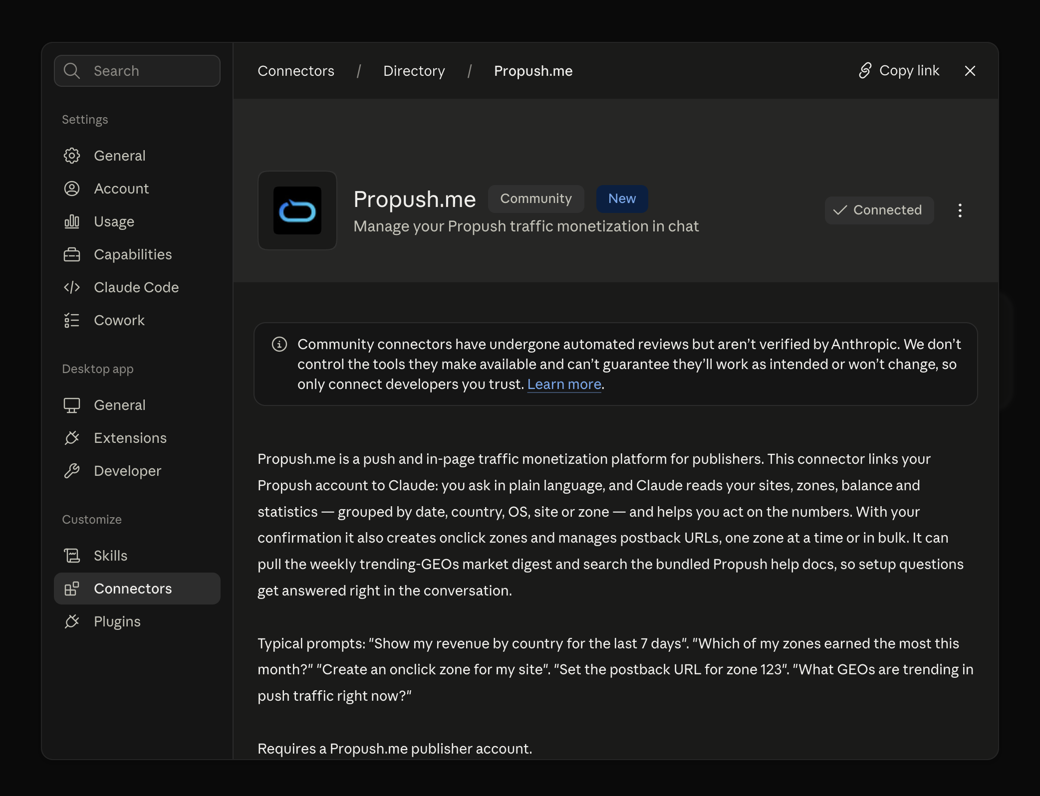
There's no file to download or install. The connector runs as a remote server: you just add its URL to your AI agent once, go through a quick authorization, and you're in.
The connector URL is: https://mcp.propush.me
Setup instructions for Claude and ChatGPT are available at mcp.propush.me.
After that, your AI agent has full access to your ProPush.me account. Here's what it can actually do:
Here are examples of how it works:
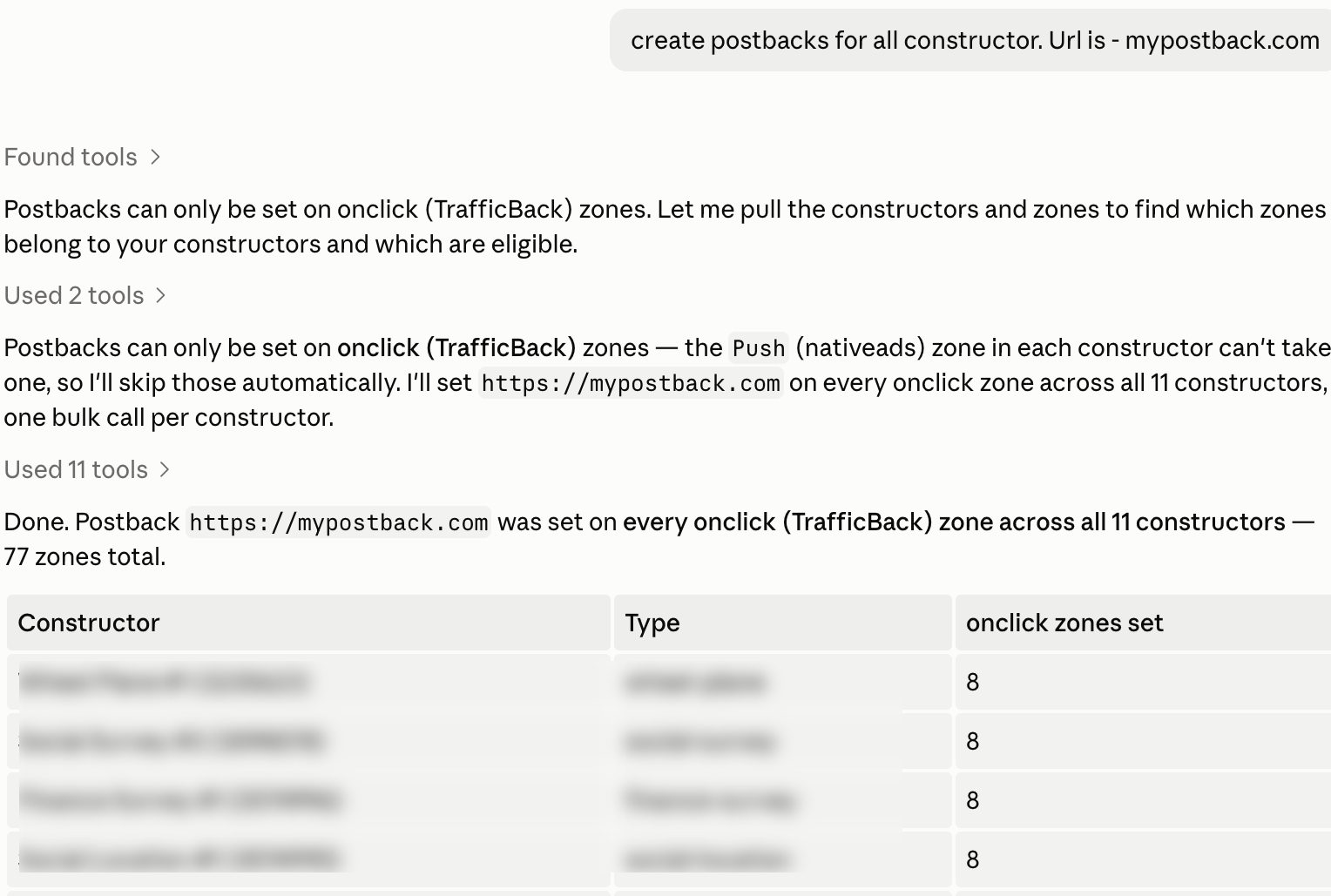
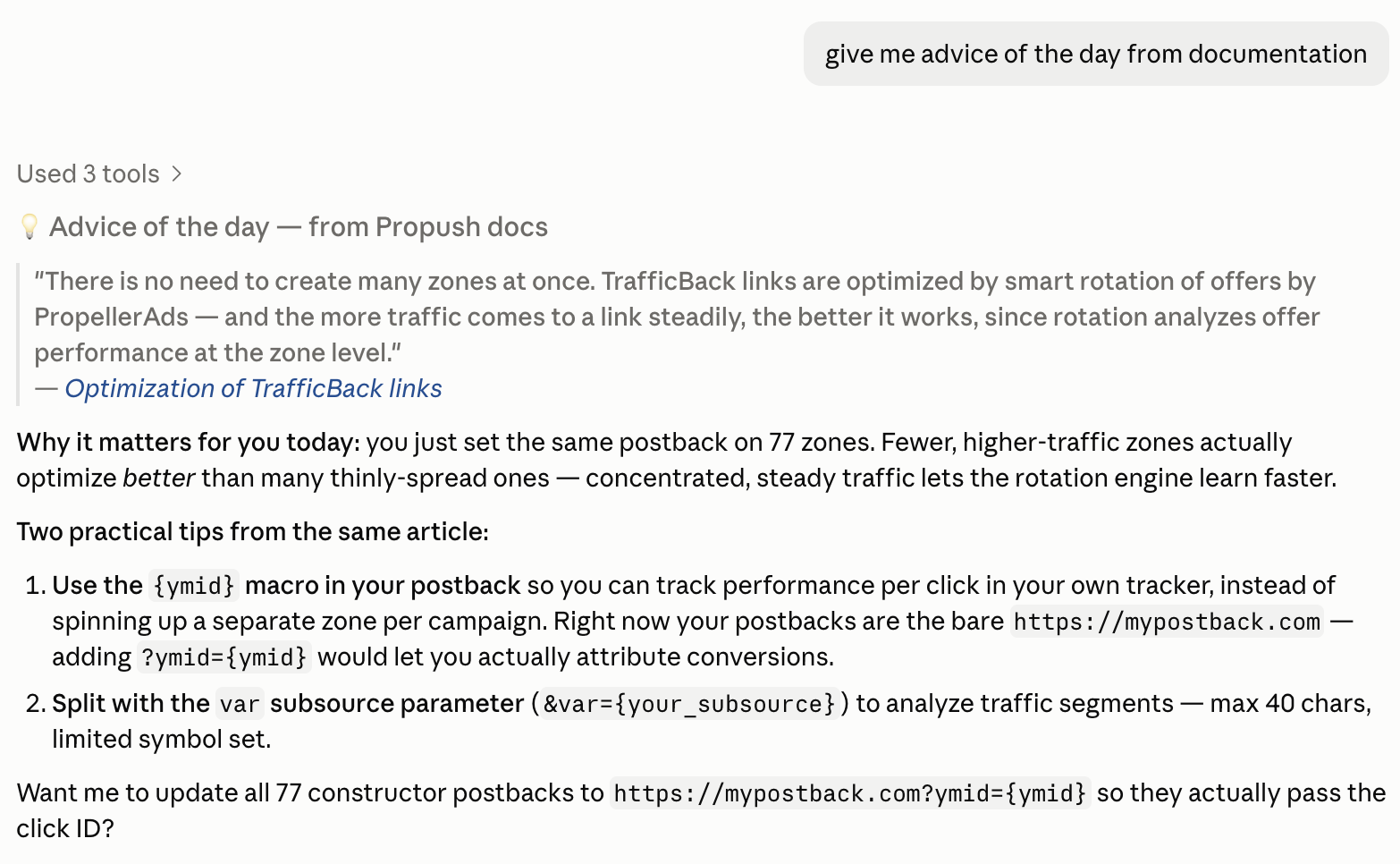
The obvious reason: stop switching tabs every time you need a number. But there's more to it.
So, all of this is about not having to open your dashboard every time you just need an answer or a quick fix.
Karina Arkhangelskaya, ProPush.me Sales Director:
AI has clearly become a part of our daily working routine - automations provide speed and scale, and nowadays solo affiliates can reach media-buying profits that were possible only for large teams before. The number of campaigns and tests that you launch, triggers for smarter optimisation - you name it. Propush MCP steps up and becomes one more tool to use - set it up today and speed up your routine with Propush.me to reach new heights of traffic monetization!
Through OAuth – the same login flow you've seen on every ‘Sign in with Google’ button. You authorize the connector in your browser, and that's it. Your actual password never goes anywhere near the AI agent.
Yes, anytime. Disconnect the connector from your agent's settings, and it loses access instantly.
It doesn't do anything you didn't ask it to do. There's no background activity, no autonomous decisions. It responds to your prompts; that's it.
If you're already using an AI agent day-to-day, adding ProPush.me to it takes two minutes. After that, your stats, zones, and postbacks are one conversation away. Why open the dashboard if you don't have to?
Propush.me Constructor is built for speed: take a ready-made, working landing page with proven offer mechanics, host it yourself, tweak it with AI Assistant, and start sending traffic within a couple of hours. Out of the box, you can run it as-is and earn steadily. However, many clients prefer to customize: add specific copy, design, extra funnel steps, and their own retention mechanics. And customization always requires testing.
Testing is a skill, and even the sharpest media buying teams get it wrong sometimes: that's just how it works. The teams that win long-term are the ones who learn fast from the misses and keep the wins.
We talk to a lot of Propush.me clients who actively use Constructor and test their own landing pages. What we consistently see is that even the most experienced media buying teams regularly have hypotheses that don't hold up. That's a normal part of the process – teams that test a lot inevitably fail quite often.
This piece walks through 6 real cases (no client or offer names) where a landing customization went sideways. The numbers are real, the mistakes are specific, and – most importantly – each is avoidable.
A note on visuals: none of the images below are the original landing pages or creatives from the cases described. At our clients' request, we don't share their actual assets. What you see are similar, representative examples built to illustrate the same mechanics.
When a thematic rebrand breaks a working mechanic
A client from the entertainment vertical adapted a classic clicker landing page to a sports theme, expecting fresh seasonal visuals to boost engagement during peak season. The core mechanic stayed the same: ‘click the element a few times to move to the next step.’

What happened?
Why did it fail? The ‘click repeatedly to build up points’ mechanic worked on the original landing because it read as clear game logic: the user saw progress, understood why they were clicking, and felt in control. In the themed version, the same clicking felt random, so users didn't get why they were doing it. And the new welcome screen didn't push people to continue as well as the original did.
| Lesson learned: you can't carry a mechanic from a working landing page into a new theme without rethinking the game logic behind it. If the visual frame of the offer changes, the interaction logic needs to change with it. |
Karina Arkhangelskaya, ProPush.me Sales Director: The good news: a short 1-2 hour trial run saved the team from continuing a test that would have burned real money. So it’s a strong argument for always building in a ‘warm-up’ hour before a full-scale launch.
When optimizing one step breaks the rest of the funnel
This time, it was a multi-step survey offer. The team launched two variants of this survey: one with a faster timer, and another with extra questions added at the start. The hypothesis was the following: more questions mean more touchpoints and so better engagement and better early-stage traffic segmentation.
What happened?
Why did it fail? Optimizing one funnel step locally broke the funnel as a whole. The extra question did pull in more Age exit users (good on its own), but it also distracted some users from the first click that was meant to trigger the core monetization mechanic. As a result, a gain in one zone cost two others, and a net loss overall.
| Lesson learned: Mid-funnel changes have unpredictable side effects on the funnel as a whole. If you add a step, check not just that step's conversion, but what happened to flow before and after it. Often, an extra step results in fewer converting users at the finish line. |
Karina Arkhangelskaya: Never change more than one variable at a time. If you changed the timer, number of questions, and reordered them simultaneously, there'd be no way to tell which variable broke things and which one saved them. One test equals one hypothesis. Want to change three things? Run three sequential tests.
When visual similarity ≠ performance similarity
The team tested 4 alternative design versions of the same clicker landing page. All were nearly identical in structure and game mechanics, differing only in visual styling: background color, clickable element type, overall look.

What happened?
Why did it fail? In the losing version, the rocks lit up slightly off from where users clicked. It was barely noticeable, but it broke users' rhythm – some left the page, others made it till the end less often. The paradox: if you just open the two versions side by side, the difference isn't obvious at all. But in a real funnel, that small UX flaw cost 6% of revenue.
| Lesson learned: On ‘click fast’ landings, every micro-element of UX carries financial weight. Looking the same doesn't mean performing the same. When two nearly identical landings get different results, it means one of them has a small UX detail breaking the flow. Finding that detail is a separate part of the analysis, and it's often worth more than the test result itself. |
When better UX doesn't mean better monetization
A landing page of the proven offer had an element that routed to an extra monetization zone after certain user actions. The team tested a cleaner version without this element, betting that a simpler UX would remove the distraction and thus boost the conversions.
What happened?
Why did it fail? Simplification removed a source of extra monetization but didn’t compensate for it anywhere. The idea that simpler converts better didn't hold up here: the main flow's conversion had a different bottleneck than the landing's complexity.
| Lesson learned. Better UX and better monetization aren't synonyms. When you edit a working landing for quality or aesthetic reasons, always test both sides of the trade: what you'll gain and what you'll lose. A working ‘ugly’ mechanic often outperforms a ‘pretty’ one. If you remove an element because it looks unnecessary, check what share of revenue it generates first – it might be unnecessary for UX but a workhorse for monetization. |
When a failed landing is worth launching as a separate offer
A client reworked a customized landing after a failed first test, where only half as many users reached the main exit compared to the original. The team redesigned it and reran the test to see if the redesign fixed the problem.
What happened?
Why did this failure turn out useful? At first glance, it was a second failure in a row. On closer look, the test delivered valuable information: this landing version works for a specific segment, and this insight wouldn't have existed if the team had scrapped the first version and moved on.
| Lesson learned: Lost on average doesn’t mean useless. Segment results by source, GEO, CPA model, and traffic type: often, an average-level test failure is a segment-level success. Don't discard failed landings after one run, but give them a chance to find their audience. Keep failed tests as your hypothesis archive: sometimes 6 months later traffic conditions shift, and an archived landing suddenly starts working. |
When small visual details outweigh design logic
The team ran a Social vertical and tried a radically different format: adding a pre-pop with a segmentation question, plus a simplified version without the pop-up, to compare both against the original landing at once.
What happened?
Why did it fail? The 'next step' buttons were physically smaller on the new landing, even though the design looked the same at first glance. The characters in the new creative were also less eye-catching than the originals. So instead of testing'a different survey format, the team ended up testing the same thing, but with weaker CTAs and visuals.
| Lesson learned: Small visual details – CTA size, contrast, how eye-catching the imagery is – can matter more than design logic. If you're reworking a landing that already works, don't lose what made it work, even if you're not sure why it worked. |
Karina Arkhangelskaya: Your best insurance: always run a control branch alongside your test. Without one, you won't catch a drop early — you'll be comparing against 'historical' stats skewed by seasonality, traffic changes, and a dozen other factors. With a control, you'll know within a couple of hours that something's wrong.
Based on patterns across all the cases above, plus insights from tests that didn't make it into this article:
Constructor is about taking a ready-made, working landing with proven mechanics and getting traffic running fast. That's enough to earn average results on average offers in an average segment.
But breaking through that ceiling takes customization. And customization always means testing. And testing always means some share of failures.
Treat that as part of the job, not as a sign that you're ‘not good at this’: everyone gets there through failures – most people just don't talk about it. The six cases above are real stories from teams that still outearn the average on Constructor. Simply because they keep testing after the first, second, and third failure – and today, with AI-generated landing variants cutting the design side of that loop down to minutes, there's even less reason to stop at the first misstesting after the first, second, and third failure.
If there's one thing to take from this article, let it be this: test more often, don't quit after the first failure, always keep a control branch running. The rest follows.
Most affiliates know that no campaign lasts forever. What many underestimate is why performance starts slipping in the first place. When a profitable campaign begins losing momentum, the ‘usual’ suspects are easy to identify:
Of course, all of these things can affect performance (and sometimes they really do). Just as often, though, the problem is much closer to home:
The funnel that worked so well a month ago simply hasn't changed while everything around it has.
Every campaign eventually reaches a point where fresh ideas outperform the original version. The goal isn't to wait for that moment—it's to prepare for it.
Your campaign goes live with a promising funnel.
CTR, CR and ROI look healthy, so you increase your budget.
Users become familiar with your messaging while competitors launch fresh angles.
CTR and conversions gradually decline.
Create the next funnel variation before performance becomes a problem.
Your audience has already seen the same headline, scrolled past the same hero image, and they've clicked (or ignored) the same CTA enough times that it no longer catches their attention. Meanwhile, other affiliates are launching fresh pages, experimenting with different angles, and learning what resonates with the same audience you're trying to reach. Every campaign starts with assumptions, and every new version is an opportunity to replace those assumptions with real data.
Now…when you hear “A/B Testing,” chances are you’re probably thinking it’s what you do BEFORE you scale…
Well, if that’s how you play this game – it’s over for you.
Let’s talk about how we keep your campaigns profitable after they’ve already brought you some cash, shall we?
Experienced media buyers rarely think of a funnel as a finished product. Instead, they see it as something that “never sleeps”. Traditionally (and scientifically), for something to evolve, you need to test its angles, dimensions, and limits.
For example, take on the role of assuming one headline will outperform another.
Or a shorter landing page will reduce friction.
Or a different CTA will encourage more users to convert.
All of these are your assumptions, which unfortunately won’t bring you any profit (but will do quite the opposite). Remember yourself back at school, when your science teacher asked you to conduct a “fair test”, by growing 2 different plants in the same liquid?
Yeah… that's exactly what A/B testing is, but for affiliate marketing.
As explained by Coursera, an A/B test (also known as split testing) is a simple way to compare two versions of the same asset under identical conditions. Traffic is divided between the two versions, with only one element changed at a time. That could be a headline, hero image, CTA, landing page layout, or even an entire funnel. Once enough data has been collected, you compare the results and keep the version that performs better.
Same as for plants, huh?
In affiliate marketing, don’t expect to find a perfect funnel on the first try. You’ll have to put in the effort and continuously improve your campaign(s) based on real user behavior (aka. data) rather than “going with what your gut tells you”. Remember that every successful campaign is usually the result of dozens of small decisions that have been tested, measured, and refined over time.
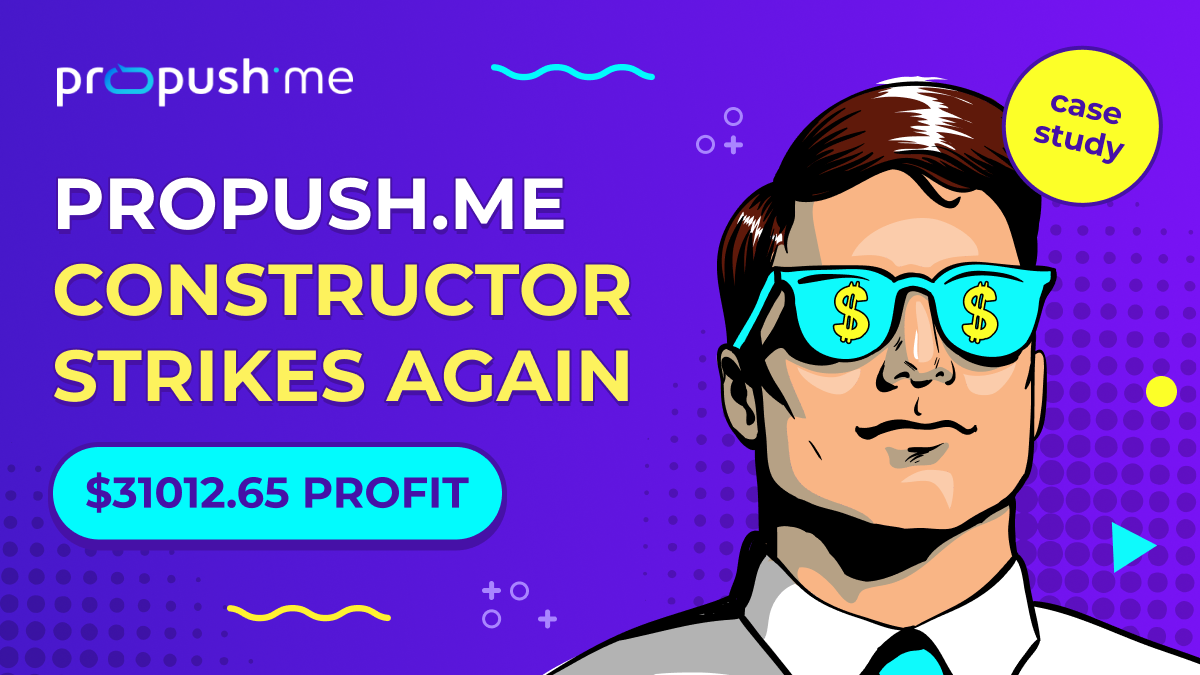
![[Case study]: How Desha made $31k with ProPush Constructor in 1 month](https://propush.me/blog/wp-content/uploads/2026/02/propush-desha-case-study-constructor.jpg)
The short answer? Almost always.
You don't have to wait until a campaign starts losing money before running a test. In fact, the best-performing campaigns are usually backed by a constant stream of experiments, even while they're generating healthy ROI.
Running an A/B test is particularly valuable when:
Even a well-performing funnel can often be improved through small details and well-planned experiments. A stronger headline, a more compelling CTA, or a different page structure might not seem like major changes, but together they can have a measurable impact when it comes to campaign profitability.
A better headline. A different CTA. Another landing page layout.
Important: Before running an A/B test, make sure you have enough traffic to generate meaningful results and clear success metrics to evaluate performance. Avoid drawing conclusions after the first 100 clicks – give your test enough time to collect statistically useful data.
One of the biggest mistakes beginners make is testing random ideas instead of meaningful hypotheses. Like really… Every experiment should have ONE clear purpose: finding changes that can genuinely improve campaign performance.
You don't need to rebuild an entire landing page to improve performance. Most winning funnels are simply the result of testing one small element after another.
Start with elements that have the biggest impact on user behavior, then work your way down to smaller optimizations.
For most campaigns, the creative is where optimization begins. Experiment with different formats, visuals, messaging angles, or opening hooks to see what captures attention most effectively. Sometimes a completely new concept outperforms weeks of minor design tweaks. For example, why not try that bold-ass shiny red heading for one of your campaigns targeting SEA?
The same offer can be presented in dozens of different ways. One headline may spark curiosity ("The mistake most affiliates don't realize they're making"), another creates urgency ("Don't let another profitable campaign lose momentum"). Testing different prose doesn't require rebuilding an entire funnel, yet it can have a noticeable impact on both CTR and CR.
Once users click your ad, the landing page becomes the deciding factor. Every editable element (from the headline and body copy to the CTA and page structure) is another opportunity to improve performance through testing.
With ProPush Constructor and the built-in AI Assistant, creating a new variation doesn't mean rebuilding an entire funnel. You can quickly update headlines, rewrite copy, modify CTAs, rearrange sections, or customize layouts in just a few clicks, making it much easier to validate new ideas while a campaign is still running.
Even small changes can have a measurable impact. A stronger headline may capture more attention, clearer messaging can improve engagement, and a different CTA might encourage more users to convert. The key is to test one element at a time, measure the results, and let the data guide your next iteration.
Instead of manually managing monetization, ProPush Constructor allows you to focus on improving the parts of your landing page that directly influence user behavior. Since monetization zones are already integrated into your pages, your time is better spent testing different headlines, layouts, messaging, and calls to action that can increase engagement and overall performance.
Testing different headlines, page layouts, messaging, or calls to action often has a much greater impact on overall performance than changing the offer itself. This approach lets you spend less time managing monetization and more time optimizing the parts of your funnel that are directly under your control.
Not every optimization is visible to users. Page speed, mobile responsiveness, redirect logic, broken elements, and unnecessary friction during the conversion process can all reduce performance without obvious warning signs. Before testing new ideas, make sure technical issues aren't preventing your existing funnel from reaching its full potential.
Remember: The goal of A/B testing isn't to change everything at once, but to make deliberate improvements, measure their impact, and build a clearer understanding of what drives results.
Even experienced affiliates occasionally make mistakes that make A/B test results difficult (or even impossible) to trust. The good news is that most of the issues listed below are easily avoidable once you know what you’re doing.
One of the most common mistakes is changing several elements in the same experiment. If you modify the creative, landing page, and CTA all at once, there's no reliable way to tell which change actually influenced the outcome.
No matter how tempting it is to change everything at once, remember to modify one variable at a time (fair test, remember?). That way, every improvement can be traced back to a specific change.
We know how you feel ready to declare a winner after the first hundred clicks, especially when one variation looks noticeably stronger. In reality, though, early results can be misleading.
Give your test enough traffic to reach statistical significance before making optimization decisions. What appears to be a clear winner after a few hours may look very different once more data comes in.
A/B testing only works when both versions are shown under the same conditions (fair test!). If one variation targets a different GEO, audience segment, or traffic source, you're no longer comparing the page itself (you're comparing completely different users!).
Keep your audience as consistent as possible so the results reflect the changes you're testing, not differences in traffic quality.
CTR is important, but it rarely tells the whole story. A creative that generates more clicks isn't always the one that produces the highest revenue. Pay attention to the full picture, including conversion rate, EPC, ROI, approval rates, or any other metrics that matter for your campaign goals.
Sometimes a variation with a slightly lower CTR turns out to be the most profitable once the campaign reaches the final conversion stage.
Avoiding these mistakes won't guarantee that every experiment produces a winner, but it will give you a foundation where you’ll stand with confidence. Once your testing process becomes structured and consistent, optimizing campaigns becomes far less about guesswork and far more about making informed decisions.
A successful testing workflow isn't about using as many tools as possible but trying to remove every obstacle between a new idea and a live experiment. Chances are, you already have everything you need to measure results. Traffic sources provide campaign data, trackers split traffic between variations, and analytics tools reveal how users interact with a page.
But then, what about the bottleneck no one stresses enough?
Building the next version of your campaign.
You come up with a better headline, a different page structure, or another way to present the offer, but turning that idea into a working landing page can easily take longer than the experiment itself. As a result, promising hypotheses stay in your notes instead of reaching real users, and your old campaigns continue eating up your budgets while you procrastinate.
Let’s face it..
Your landing page builder becomes JUST AS IMPORTANT as your tracker.
A good landing page builder removes the repetitive work, so you can spend more time testing ideas instead of rebuilding pages.
Use an existing funnel as your starting point instead of building everything from scratch.
Edit headlines, CTAs, layouts or entire sections to create a new variation.
Create dedicated versions for different GEOs, audiences or traffic sources.
Publish a new funnel variation in minutes and start collecting real data.
Trackers tell you which variation wins. ProPush.me Constructor makes creating that variation significantly easier. Instead of rebuilding pages from scratch, you can start with proven templates, edit any landing page element with the AI Assistant, take advantage of built-in monetization zones, and launch unlimited customized versions while maintaining full control over your funnels. Together, they make continuous testing faster and far easier to sustain.
Concluding, one thing affiliate marketing teaches you pretty quickly is that there are no permanent winners: Not offers. Not creatives. Not landing pages.
The campaign that's bringing you your highest ROI today will eventually lose its edge, and that's perfectly normal. Even BLOCKBUSTER, once a thriving success, eventually became outdated and was forgotten.
The real question isn't if it happens. It's whether you'll have the updated version ready before everyone else outgrows your campaign.
A friendly tip from us: Don't spend your time chasing the mythical "perfect funnel." Build, test, learn, and repeat until the numbers tell you it's time to move on (and then, do it all over again).
If building another landing page still feels like a project you'll "get to later," you're probably testing fewer ideas than you could be. In performance marketing, fewer experiments usually mean fewer opportunities to find your next winner.
That's exactly why we built the ProPush.me Constructor and AI Assistant. Not to replace your strategy or tell you what to test, but to remove the friction between having an idea and putting it in front of real users. Because the sooner a new variation goes live, the sooner you know whether it's worth scaling (or whether it's time to try something better!).